#135 | Indexed UL on the Risk Spectrum – Part 1
In preparing for a presentation that I’m giving on Indexed UL in January, I was looking for some old marketing materials for a defunct product and kept stumbling across articles, presentations and graphs that were all focused on telling the same story – that Indexed UL fits directly between traditional UL and Variable UL on the risk spectrum. All of these materials were long on story and short on analysis. They were conceptual, to put it charitably. Risk itself was never properly defined. The spectrum always included just those three categories and nothing else, with Indexed UL slotted perfectly in the middle. In this purely conceptual form, there’s such strong intuitive appeal to it that it’s practically become received wisdom in the Indexed UL space. Everyone knows that Indexed UL sits between Universal Life and Variable UL. But is it actually true?
Let’s start first with a more basic question – what is the definition of risk? According to Merriam-Webster’s, risk is the possibility of loss. This is a very interesting and problematic definition for Indexed UL. One of the core tenants of indexed crediting is that it can never have a negative credit due to market performance. Obviously, clients can and will lose money due to policy charges but policy charges aren’t a part of the index crediting strategy. They’re part of the life insurance contract. As a result, looking at the risk profile of Indexed crediting itself means that we can’t look at the life insurance policy that happens to wrap around it. And on that measure, Indexed UL has exactly the same risk as Universal Life. Neither product allows for the possibility of a loss.
In finance, however, we take a more expansive definition of risk. Finance generally views risk as the variability of returns rather than the sheer possibility of a loss. The simplest metric for gauging variability of returns is standard deviation. So, how does Indexed UL compare to Variable UL on the measure of standard deviation of annual returns? Again, it’s tricky. Standard deviation is a shorthand way of describing a standard normal distribution and works well for things that conform to the standard normal distribution, or the bell curve, as it’s often called. Annual S&P 500 returns, which we can use as a proxy for Variable UL fully invested in a large cap index fund, don’t quite fit to the bell curve. But if S&P 500 returns are 80% of the way, then Indexed UL is 0% of the way there. Take a look at the return distribution for Indexed UL.
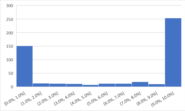
Indexed UL returns tend to clump at the floor (0%) and the cap (10%, in this scenario). They are a barbell. Or, as I prefer to call it, Batman’s helmet. But either way, standard deviation is quite possibly the least accurate way to describe this return distribution. It is entirely meaningless. And if you see anyone using standard deviation on annualized Indexed UL returns, then you can pretty much assume that they don’t even have a conversational knowledge of statistics.
In order to look at Indexed UL through the lens of standard deviation, we have to stretch out the timeline so that the returns start to normalize. I chose 10 years because it’s enough time to at least let the returns sort themselves out. Take a look at the return distribution for 10 year IRRs.
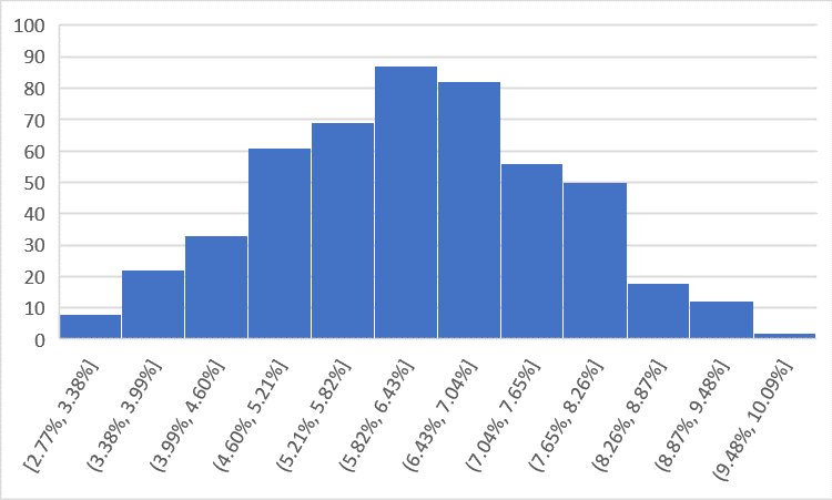
Now, that’s more like it. Not perfect, but close enough. So what can we glean by looking at standard deviation as a measure of risk for both Indexed UL and Variable UL/S&P 500? No surprise, Indexed UL returns are quite a bit less variable than the S&P 500, which has a standard deviation of 10 year returns of 5.9%. Indexed UL, on the other hand, has a standard deviation of just 1.4%. The S&P 500 has four times more variability over 10 years than Indexed UL. If you were to imagine the product risk spectrum using this measure, then you’d see traditional Universal Life to the left, Variable UL to the right and Indexed UL sitting a quarter of the way to Variable UL.
Except, this is where things get tricky. Not all variability is the same. We all know that we’d be plenty happy accepting a certain amount of variability of positive returns without accepting the same level of variability if there was also the possibility of negative returns. We need a measure that takes into account both the variability of returns and the fact that negative returns aren’t the same thing, from a risk standpoint, as positive returns. There’s not a great statistical tool that I know of, so I’m going to use a simple one that provides a keyhole perspective on this issue.
When people say “average,” they mean one of two things in finance. The first is the simple arithmetic average of a certain string of numbers – add them all up, divide by the number of observations. It’s the average we use in our everyday lives. When we’re talking about returns, the arithmetic average tells us the average return in any given year. If we want to understand the expected return over several years, we turn to the geometric average or compound annual growth rate (CAGR), as it’s sometimes called. It takes into account the fact that negative credits are not the same as positive credits. An asset that goes up 25% in the first year and then goes down 25% the next year does not end at even, which is what the arithmetic average would tell you. It’s down 6.25%. The CAGR/geometric mean captures that. The geometric mean takes variable rates over a period of time and translates them to an effective compounding rate.
If we were to compare the arithmetic average of a particular string of returns to the geometric average of the same string, the difference between the two numbers would give an indication of the variability of the returns and, more importantly, the degree to which negative returns were in the max. The bigger the gap, the more variability and downside in the returns. The example above (+25% then -25%) would generate a 0% arithmetic mean and a -3.18% geometric mean, which tells you that there was quite a bit of volatility and downside risk. Looking at the 10 year return sequence, the gap between the arithmetic return and geometric return for Indexed UL averaged just 0.08% over 500 scenarios of 10 year S&P 500 return sequences. Using the exact same 500 scenarios, the gap for the S&P 500 itself was 1.32%. So, using this measure of risk, Indexed UL is about 6% as risky as Variable UL. On the risk spectrum here, Universal Life and Indexed UL are sitting so close to each other that their labels overlap.
In short, the answer about where Indexed UL sits on the risk spectrum is complicated. It depends. For a capped account, based on the analysis above, Indexed UL either sits directly on top of Universal Life, right next to it or about a quarter of the way to VUL. Definitely not in the middle. If you were to chart it out, it might look something like this:
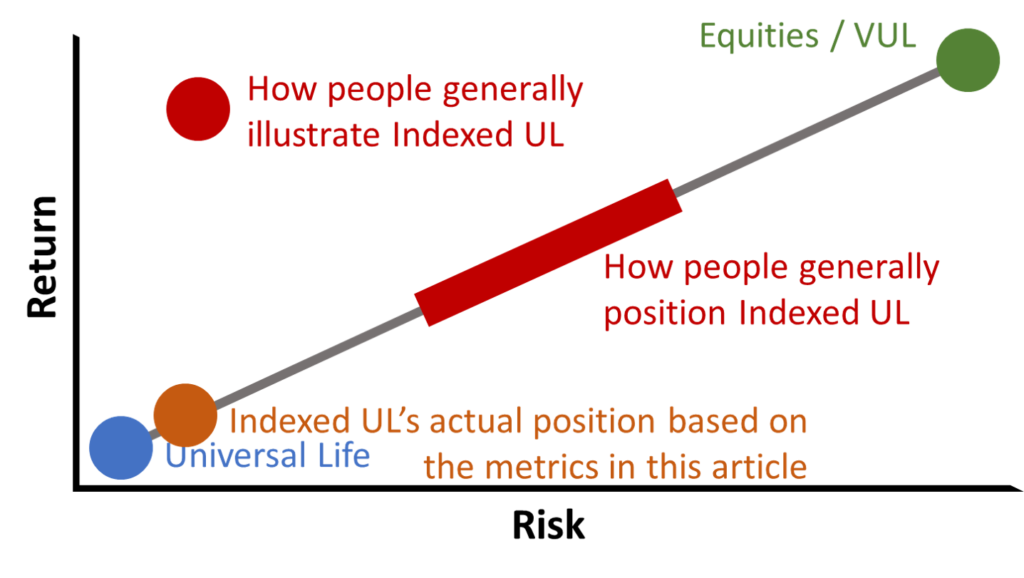
Of course, this is not just a conversation about risk. As the graph above shows, it’s also about returns. Why would anyone take risk unless they were going to be compensated for it with a higher return? That’s an efficient market. With Indexed UL, the story that it slots between VUL and UL is convenient because it allows for higher rates than UL but lower rates than the maximum 12% VUL illustrated rates. If you ask most folks what rate they actually feel comfortable showing Variable UL, they’ll say between 6% and 8%. Ask them the same question about Indexed UL and they’ll say 6% or maybe something a little lower. But think about it. If Universal Life illustrates at 4% and VUL is at 6%, then that implies a 2% equity risk premium (not exactly, but let’s go with it). Using standard deviation of 10 year returns as the measure, then Indexed UL should illustrate at 4.5%. Using the gap between arithmetic and geometric average returns, the proper illustrated rate would be something like 4.12%.
If that’s really uncomfortable to you and you don’t like those returns for Indexed UL, then just juice the rate that you would feel comfortable illustrating on Variable UL. If you’re comfortable at 8%, then conceivably you could illustrate Indexed UL at up to 5%. VUL at 10%? Now we’re talking. Now you can illustrate Indexed UL at 6%. Except, if equities are going to do 10%, wouldn’t your client be better off in a VUL with an indexed account option so they can take some more risk and get paid for it?
This little discussion highlights the central conceit, the central misunderstanding about Indexed UL. It is not a product that is, first and foremost, designed to deliver higher returns over the long run than a VUL fully invested in equities. That violates every rule in finance and common sense. Most agents don’t go that far. But they do go so far as to say that Indexed UL will perform significantly better than Universal Life over the long run. That seems much more reasonable and it’s based on the idea that clients should get paid for greater risk. But as we’ve seen, when you actually quantify the risk, it ain’t so different from Universal Life. And, therefore, neither should be illustrated rates for Indexed UL. Simple as that*.
*Not quite so simple as that. What about indexed account options without caps? What about proprietary and volatility controlled indices? We’ll tackle those questions (and a few others) in the next two posts for Members of The Life Product Review only.